University-level Logos

The Villanova University logo is the center of our visual identity and the foundational building block for the full catalog of University logos that represent all levels of our community. All logos are numbered for easy reference (ex. VU01BLUE) and are available in BLUE, BLACK, or WHITE (transparent). Only the BLUE versions are shown in this gallery. When requesting a logo via the online logo request form, please reference the logo by the provided file name and appropriate color.

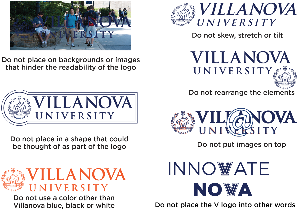
Examples of Logo Usage Requirements

Do not place on backgrounds or images that hinder the readability of the logo

Do not place in a shape that could be thought of as part of the logo

Do not use a color for the logo other than Villanova Blue, black, or white

Do not skew, stretch, or tilt

Do not rearrange the elements in the logo

Do not put images on top of the logo

Do not place additional working in a location that will be seen as part of the logo

Do not place the V logo into other words.

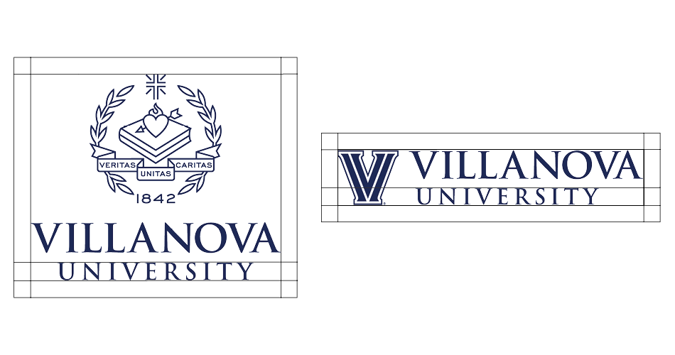
Example of Logo Clearspace

To ensure its integrity and visibility, the Villanova University logo and the Villanova “V” should be kept clear of competing text, images and graphics. The logos must be surrounded by an adequate clearspace—in any given format, a space equal in size to the height of the word “University”, as shown above.

Guide to Logo Minimum Size Requirements

The Villanova University logos may be scaled proportionately to fit everything from directional signage to small brochures. To ensure successful reproduction, the crest should not be reproduced smaller than .5 inch high and the V should not be reproduced smaller than .25 inch high.

Logo Clearspace

The University's mission of fostering an academic community of students who learn to think critically, act compassionately and succeed while serving others is captured in our University tagline.

When using the tagline on it’s own, please do not typeset (key in by hand), but use the existing artwork for the tagline to ensure consistency with font, punctuation, and registered trademark designation.

For help on how to use the tagline in running text, please refer to the editorial style guidelines.


Logo Clearspace

The Villanova “V” University and College-level Using the University Wordmark and Villanova V logos are more appropriate for use when the space available forces the crest to be smaller than ½ inch high. To ensure successful reproduction, the height of the “V” should not be reproduced smaller than ¼ inch high.

Logo Clearspace

For instances where the logo needs to be reproduced smaller than ¼ inch high, we encourage using our wordmark, which has been typeset into a usable graphic file to ensure the relationship between the words “Villanova” and “University” are maintained.

If you have questions about which mark is most appropriate, please contact the Marketing department at creatives@villanova.edu or
610-519-3909, and you will be directed to the appropriate person.