
Consider your navigation as an “outline” for your website, containing clear and logical labeled links that allow visitors to quickly find information. Ensure link labels are clear as to the destination.
Logical and Easy-to-Use Navigation
Rather than a label like “Get Involved”, be more specific (and simple) and just say “Service Opportunities”.
Simpler and more direct really IS better!
Example:
English Department
>>About Us
>>Undergraduate Programs
>>Graduate Programs
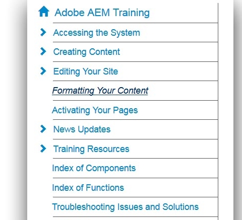
Guidelines for Your Navigation
Left navigation items should:
- be no more than 9 items/categories
- be only three (3) levels deep (the amount of subsections under that navigation item).
This makes it more readable on a mobile device as well as easier to find. Any pages deeper than the third level will appear greyed out. Create links in your main content for other pages that cannot be in the left navigation.
Direct and Easy Access.
Users want to get information in the fewest possible steps. This is not to say that everything needs to be on one page. It needs to be organized and broken up appropriately so that users can quickly find the items they are looking for without going through many pages.